


Kiko Farkas is one of Brazil’s most active graphic designers. Through a rhythmical fluidity, his work manages to capture the ethereal ideas present in the creative process without weakening or rigidly fixing their meaning. In this way, his work exists in a space that is both moderns and contemporary without falling into contradiction. Working primarily as a poster designer, he has participated in more than a dozen international posters biennials. Fifty of the posters designed for the state of São Paulo Symphony Orchestra by his office, Máquina Estúdio, were shown in 2004 at the Tommie Ohtake Institute. He is, furthermore, founder of ADG, the Brazilan Association of Graphic Designers.
Fisso l’idea (Fix the idea), designed by Marcello Dudovich for the Federazione Italiana Chimico Industriale, is a masterpiece of Italian graphic art. It dates back to 1878 and employs a muscular male figure, portrayed naked, in the style of a Renaissance David, writing the poster’s title on a wall, to promote ink and pigments.
Certainly, the moment in which a designer finds the most appropriate way to ‘fix the idea’ is one of the most fascinating in his work—an ambiguous phase involving analytically explainable methodologies, to be sure, but also unexpected insights that materialise the design concept in a specific form. It is also the juncture leading from concept to practice, an enormously important phase in graphic design which, being the branch of the discipline that occupies itself with signs, is the first to lay the basis for the final perception of a given thought, whether it be abstract, logical or fantastic.
Thus, for instance, in areas ranging from computer graphics to communication tools for teenage markets, i.e. from the highest level of information content to the highest level of stylistic potential (passing through brands, coordinated identities, type design, etc.), graphic design is responsible for catalyzing ideas (indeed, of fixing them) into objectively perceptible things. The skills, mores, customs and data which make up the designer’s cultural heritage, or which are required by the client, are all dumped into the hic et nunc—that precise moment—of “fixing the idea”.
This does not mean that it is easy to find a solution to the problems that arise in the visual designer’s trade, but simply that the aim of design is to conjure up the visual elements hidden among thoughts; to manifest the structures joining them; to interpret their connotations, whether they be inconspicuous or not. And this must be done with images whose efficiency increases in keeping with their ability to condense an idea.
The one trait evident in the varied and complex work developed by Kiko Farkas (and his design firm, Máquina Estúdio) is the power present at the moment of ‘fixing the idea.’ A power that is revelatory rather than deterministic, in the sense that his work draws attention to the chains—of thoughts, concepts, values—that underlie it without conditioning the evocative potentiality generated by images. It instead lets them vibrate, much in the same way that the strings of a guitar produce sounds. Not in vain have the terms form and rhythm been used to describe his work. Indeed, rhythm is mathematical proportion and geometry, its visible form. But the geometry in Farkas’s posters is never rigid, tautological or schematic.
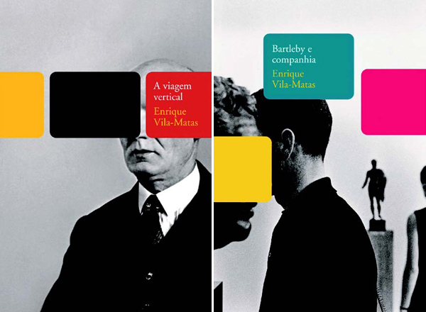
Book cover for the Enrique Vila-Matas collection, Cosad Naify press, 2005.
Perhaps it isn’t even Euclidian but fractal, for despite making use of lines, curves and modular areas, it swerves clear of rigid mechanisms, and thus appears as something fluid, sinuous, uninterrupted. It is an efficient and evocative geometry—one that is ideal for ‘fixing the idea’; for reinstating, with whatever graphic treatment is chosen, the key concept—or, better still, the network of concepts—inherent in the work to be developed. In this sense, the work of Kiko Farkas is ‘modern’.
His approach does not waive the “design hope” extolled by Tomas Maldonado, vindicating as it does the existence of objectives; the possibility of building up meaning; the relevance of images and signs. It does not reject methods of joining the signified with the signifier—to use two terms of classical semiotics—nor the possibility of relating them with their (especially social and economic) reference contexts.
But it is modern in a contemporary way (forgive the oxymoron) because it does not use the ‘modern’ as a style (the International Style already did this in the 1950s), nor does it vindicate the tenets of the Modern Movement, i.e. of Rationalism, in a context which in this day and age is completely alien to the one that produced those ideologies. What is really modern is the idea of being able to interact with the culture that has sired a particular way of making design. It is not a creed, but a practise.
An element which, perhaps, was pushed into the background during the last few decades, displaced by a superficial passion for inventive or creative ‘joy’, and which is now being rediscovered by many, designers being among the first (suffice it to mention the First Things First poster published in Adbusters in 1999), in times of The Decline of Western Civilization (the beautiful title of Penelope Spheeris’s 1981 punk film).
A practice that induces an immersion in surrounding reality, proposing concrete actions, not abstract strategies; that uses all the means at its disposal to provoke a reaction from the public, not from a target; that is always capable of acting as a responsible intermediary between the client and the user. Precisely that which, ultimately, seems to be the characteristic trait of Kiko Farkas’s oeuvre.
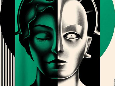
 Poster for the State of São Paulo Symphony Orchestra, 2004.
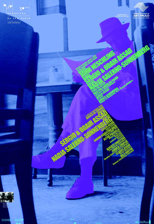
Published in Experimenta 59.