


China is a hotbed of graphic design. As computers transform the country’s vast calligraphic tradition, each point of reference strengthens its identity. Hong Kong’s westernising bent, Beijing’s traditionalist nature and Macao’s hybrid character exist side by side with the emerging personalities of Shanghai and Guangzhou.
“Asia is a hotbed of global design and its designers are earning an international reputation”(2) —so says Freeman Lau, President of the Executive Committee of the Hong Kong Design Center, who bases his claim on the flurry of activity currently spreading across Asia, with increasing attention centring on communication and design. A craving for luxury, a skyline of futurist buildings and a renewed interest in image and communication convey the idea of a country that no longer wants to follow in the wake of other nations, albeit still feeling torn between its thirst for westernisation and the rediscovery of a deep-rooted identity. In this rapidly changing setting, graphic design, which until a few years ago saw whole generations of Chinese students trained in western schools, is finding a new role and occupying an unpre-cedented place in society: a trade that is rapidly consolidating, the institutions and professional studios that make up the sector give us a superficial idea of the degree of innovation that is being attained by this country.
The standard-bearer of this movement is the Hong Kong Design Center, the entity behind the Design for Asia Award—a prize intended to award companies that attain a level of excellence in innovation—though mention should also be made of Business Design Week (“a week of seminars, meetings and conferences on branding and innovation, Asian and global trends and potential practices and strategies designed to enhance business and improve company competitiveness”(3), the Guangzhou Triennial and the China International Poster Biennial. These are just a few of the highly original initiatives looking to promote a design culture capable of bringing to light a recognisable Asian identity, which find their institutionalisation in the vision of the Hong Kong Polytechnic University School of Design: “Hong Kong is a laboratory that can be expected to give rise to a new life style capable of generating new design names and new design experiences”(4). This process of development is dependent on strategic design, marketing, design and communication information and innovative technologies5 —competences which not only Hong Kong but also several other large Chinese cities are striving to develop, bearing witness to the country’s determination to create research centres that can compete with similar institutions around the world and to show that China is not only capable of “manufacturing” but also of becoming a driving force of innovation through its designers.
China is not only capable of “manufacturing” but also of becoming a driving force of innovation through its designers.Just who are these designers? Min Wang, Song Xiewei, Liu Zhizhi, Wu Tong and the Wang Zi-Yuan and Yang Lei partners in Beijing; Henry Steiner, Tommy Li, Sandy Choi, Hon Bing Wah, So Man-Yee and Alan Chan in Hong Kong; Wang Xu in Guangzhou; Jian Ping Huang and Lili Zhang en Shanghai; and Ung Vai Meng and Victor Hugo Marreiros in Macao, to mention but a few of the characters livening up the Chinese graphic design scene.
The Director of the Design Department in China’s Central Academy of Fine Arts (CAFA), Min Wang, is a prominent figure in Beijing. Dean of the School of Design, he combines his practice of the profession with research and teaching(6), his main objective being to furnish students with an international approach to design: “Over the past ten years, student typography workshops at Yale have endeavoured to reinterpret the West’s modern approach to culture from a transversal and trans-national cultural viewpoint.”7 An international approach that is also mirrored by his output: “Subtle yet powerful. Thus is the art of Wang.”8 Designs that come alive through a stratification of signs capable of generating a dialogue between the Modern and the Asian tradition, calligraphic and alphabetic culture, Rationalism and Deconstructivism, and artisanship and technology. Different styles, learned references that range from North American Pop Art to the early stages of the Californian Style by way of the International Style, until arriving at a series of recent experiments with images that are highly uncommon.9
Song Xiewei’s output is quite different. A refined editorial designer, in his work the treatment and control of the surface area seems to preside over the design through cuts, clippings, transparencies, superimpositions or, occasionally, completely white spaces that form the backdrop for a handful of iconographic signs. At other times, it is the use of a photograph that sustains the composition—a photograph that yells out, taking up all the space, and is also treated like a surface. Attention to packaging, the handling of the book as an object and the different ways of accessing its contents suggests that, in his work, graphic design goes beyond the mere modelling of a page, embracing the principles of industrial design.
In contrast to this methodical approach we find the audacity of a new generation of Beijing designers (1973/1977), who have recovered some elements of the style peculiar to their culture and have reinterpreted them in a contemporary language. I am thinking of the work developed by Ye Jun, for instance, or that executed by “Wang Zi-Yuan and his partner, Yang Lei, in which a novel interpretation of the tokonoma culture recovers the culture of empty space and the dimension of silence, while the compositional tradition of calligraphic painting uncovers a new interpretative language.”(10).
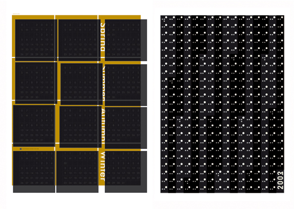
Calendar, non-commercial work, He Jun, 2003.
Beijing culture is probably more predisposed to a reinterpretation of the local tradition, while in Hong Kong a different scenario is encountered, with designs that display greater western influence. An emblematic case is that of Henry Steiner, an artist born in Vienna who, according to Min Wang, “has had great influence on Hong Kong.”(11) A Hong Kong citizen for the last forty years, Steiner can be considered to be a Chinese citizen to all intents and purposes, having marked the visual culture of the place while at the same time being influenced by it. “A master of duality,”(12) Steiner bases his vision of reality on dichotomies which he transfers to his designs. “Belonging to both the East and the West,”(13) his designs bear witness to the evolution of a highly personal language and style—which developed from an exclusively Rationalist mould—in which the continued use of metaphors, decontextualised objects and a “typography without type derived from the fusion of words and images, symbols and objects”(14) enables him to “transform ordinary compositions into extraordinary images.”(15)
Beijing culture is probably more predisposed to a reinterpretation of the local tradition, while in Hong Kong designs that display greater western influence.In Hong Kong we also find a black comma on a lacquer-red background making up the cover of Sandy Choi: Printed Matter. A comma that is a statement of intentions for a book that “is not a full stop. It’s just a comma…” For this appears to be the philosophy of Sandy Choi, who sees his professional career (and, perhaps, his personal life) as a long journey that began in 1985, after earning his degree in Graphic Design at Saint Martin’s School of Art in London, from where he went on to gain a broad and wide-ranging experience from the most prominent graphic design studios and distinguished advertising agencies in Asia. A calm man with a profound sense of time, Sandy Choi “quotes by heart a passage where Paul Rand recommends simplicity, honesty, objectivity and industry. (…) His design includes Bayer, Cassandre, Lissitzky, Muller-Brockmann, Chermayeff, Tanaka, Tschichold.”(16) These references mark an oeuvre in which, at first sight, the deep influence of his European training seems to blur his Asian origins. However, after a detailed analysis of his work it becomes apparent that Choi collects, studies and reinterprets elements of the Asian tradition in the light of a deeper deliberation in which the observation of cultures goes beyond the merely folkloric or iconographic: “Sandy Choi seizes everyday life objects and vernacular graphic forms and makes them resonate with essential visual mechanisms.”(17) And, probably, his definition of the “Present perfect” betrays a desire to bring the world up to date through a series of intellectual itineraries that lead from the past to the present.
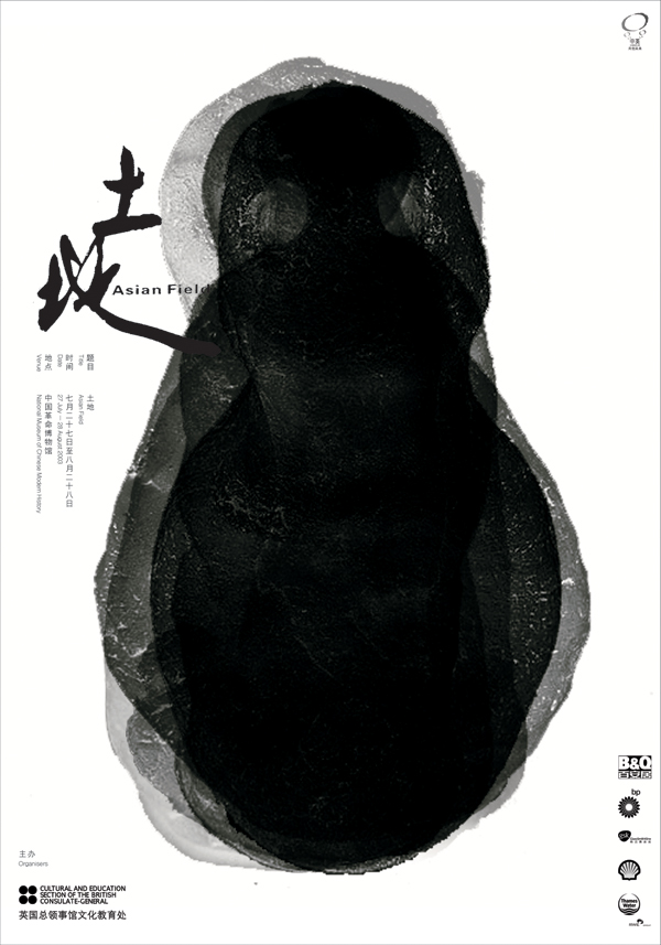 Asian Field, Cultural and Education section of the British Consulate General, Song Xiewei.
In contrast, the designs executed by Tommy Li transmit a deep knowledge of seemingly distanced styles and languages. Thus we come face to face with works in which Californian graphic design influences give way to Dutch references until arriving at a series of austere designs reminiscent of the Swiss compositional rigour. In his light and elegantly refined posters the use of whites, greys and transparencies give rise to designs that are defined by what “they leave out” rather than what they show, their true soul residing in their “veiled” nature.
In Macao, the Chinese island that boasts of a Portuguese culture, where the form adopted by graphic design surprises for its capacity to merge Eastern and Western.But it is in Macao, the Chinese island that boasts of a Portuguese culture, where the form adopted by graphic design surprises for its capacity to merge Eastern and Western influences in the work of Ung Vai Meng and Victor Hugo dos Santos Marreiros. Born in Macao, where he continues to live and work, Ung Vai Meng represents the poetic soul of an island that is rich in antagonistic visions of the world: East and West, night and day, discretion and self-confidence: these are the different facets of Macao and they are also the contrasts we perceive in the work of Ung Vai Meng which, removed from established styles and methods, manages to wed methodology with poetry, marketing with literature, pictorial techniques with design tools. “He clearly masters all of the more conventional graphic design techniques; his beautiful, fresh posters live in a world quite far from the established concepts. The artistic strokes of his pen run through half-concrete and half-abstract shadow, and letters float up into two-dimensional space.”(18) A daring use of typography, of Carsonian cut, is reminiscent of the textual reinterpretations made by Vanderlans in his early period mixed with compositional elements of the local calligraphic tradition; but his pictorial research centres on informal experiments involving the treatment of surfaces when they are not acting as white backdrops for hybrid objects that bring to mind the investigation carried out by Markos Novak. “The stance Meng takes by confronting us with works of such hand-drawn beauty must be appreciated in a design field where the artificial technicians that are computers are commonly employed to guide creative endeavours. True originality remains an essential element within the culture of graphic design and Meng’s works will surely leave an enduring mark in the global history of posters.”(19)
This differs radically from the work produced by Victor Hugo dos Santos Marreiros, an eclectic designer who has learned to master the fine art of balancing artistic and illustrator skills with designer capabilities, creating works that are evocative of staged plays, being closer to literary novels or film scripts than to the two-dimensional aesthetic of graphic composition. “Many of his works demonstrate a magic that reminds us of watching a circus performance. They are pleasant, humorous, and at the same time bewitching.”(20) In his eclectic compositions, the linguistic elements of the European graphic tradition are “con-fused” with the languages of a daring post-modernity. Deconstructed pages and destructured texts of Carsonian flavour pursue a new harmony precisely through audacious contaminations, leading Shigeo Fukuda to consider Marreiros “one of the most precious and most dangerous and interesting designers in the global graphic-design world, like a creature from another planet. (…) His designs should be savoured silently, just like listening to music.”(21).
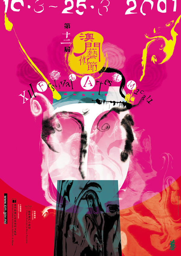 The Macao Arts Festival, Victor Hugo dos Santos Marreiros, 2001.
This runs counter to the feeling transmitted by the work produced in Shanghai, where a new generation of designers living in what has come to be the economic capital of China, “the sea into which a hundred rivers pour,” appear to be caught in a transitional phase. It was only in the 1990s that these new generations began studying outside China, and the city had to wait until 1999 before the first edition of the Shanghai International Post Design Communication Exhibition was held, an event at which young Shanghai designers were able to measure their strengths against western culture. The Chinese call Shanghai’s emerging design culture Hai-Style (22) and it is commonly acknowledged among the local designer community that its distinguishing traits can best be found in the work made by Jian Ping Huang, head of the Art Department of the Fine Arts College of Shanghai, and his assistant, Lili Zhang. Zhang forms part of a new crop of designers who are willing to assimilate new international design styles and new communication forms and strategies, but without loosing sight of the rapid transformations that are currently taking place all over China. “The graphic design group of Shanghai is opening up,” says Lili Zhang, who, as a member of this group of designers, has learned to “focus on the study of China Guide Design and Visual Sign Language, to engage in the subway sign design system.”(23)The work produced by Wang Xu, from Guangzhou, stands apart. A member of the New York Art Directors Club and the AGI, Wang Xu represents the conscious soul of a newly emerging group of designers, since in his works the predominant use of whites and transparencies, voids that substantiate the meaning of a design and a rigour of North-European cut coexist with a mature formal dexterity. It is precisely through the second edition of the Guangzhou Triennial that China seeks to foster an alliance between artists and designers from China and the rest of the world. The subject—Beyond—is a statement of intentions in itself and, perhaps, a case in point of the Cross-Cultural Design which Henry Steiner envisaged twenty years ago.
(1) This article is a summary of the comprehensive research that is being carried out by the author in the main cities of China. A book presenting the results of this investigation, offering a map and a critical analysis of the main designers currently working in the country, will soon appear in print.
(2) “Tigri Asiatiche, appunti di viaggio da Pechino, Shanghai e Guangzhou”, ArtLab, nº. 15, Integrata Editrice, Milan 2005, page 6.
(3) Ibid.
(4) From the web page: www.sd.polyu.edu.hk
(5) Idem.
(6) From the biographical notes sent by the designer to the author on April 24, 2005.
(7) Sheila Levrant de Bretteville, Min Wang and Yale, in Min Wang, Twenty Years of Graphic Design, Heilongjiang Science and Tech Publishing House, Beijing Morningdesign Co., Ltd, ISBN 7-5388-4246-2, page 14.
(8) Summer Stone, Min Wang: Simple and Complex, in Min Wang, op. cit., page 27.
(9) Some of Min Wang’s works have been displayed in international exhibitions and form part of the permanent collections of museums such as the Museum fur Kunst und Gewerbe in Hamburg and the Museum fur Gestaltung Zurich Kunstgewerbemuseum in Switzerland.Min Wang is also Honorary Professor of the School of Fine Arts of the University of Shanghai. The portfolio of his company, Square Two Design, includes Adobe, IBM, Intel, Netscape and Stanford University among its clients. Min Wang is a member of AGI.
(10) By the author, op. cit. page 7.
(11) From an e-mail sent by Min Wang to the author on March 31, 2005.
(12) Massimo Vignelli, On Henry Steiner, Idea Magazine, no. 226, May 1991, The World Masters: 8.
(13) Ibid.
(14) Massimo Vignelli, op. cit.
(15) Ibid.
(16) Henry Steiner, in Sandy Choi, Sandy Choi: Printed Matter, Longyin Review Limited, 2002, page 13.
(17) Ralph Thomas, HK Grafica, “La città dei segni,” Abitare, no. 450, Edizioni Abitare Segesta spa, Milan, May 2005, page 176.
(18) Shigeo Fukuda, Area, Phaidon Press 2003.
(19) Ibid.
(20) Shigeo Fukuda, Area, Phaidon Press, 2003.
(21) Ibid.
Article published in Experimenta 56.